
How to make Claude Code UI look better: a practical design review
Give Claude Code a clear visual target, review the rendered result, and fix specific UI problems. Includes a downloadable Markdown review skill.
5 min read
In this note
Give the review a clear purpose
Describe the job before choosing the appearance
Give the agent a visual reference
Review the page that actually renders
Give the review a clear purpose
To improve a Claude Code interface, give it a definite visual target and review what it renders. A working page tells you that the code can run. It does not tell you whether the reader can find the main action, understand the order of information, or use the page comfortably on a phone.
Start with one page and one problem. A request to make an entire site look better leaves too many decisions open. A request to make the pricing options easier to compare gives the work a purpose and a result you can inspect.
Describe the job before choosing the appearance
A startup landing page should explain the offer and give the visitor a clear next step. A dashboard should make useful information easy to find. Their visual requirements follow from those different jobs.
Write down what the visitor needs first. Then identify what competes with it. On a landing page, a large decorative image might push the explanation out of view. On a dashboard, generous spacing might make related figures harder to compare. Neither choice is wrong in every case. The question is whether it serves this page.
Replace a vague request such as “make this premium” with a concrete instruction:
Make the plan names, monthly costs and included limits easy to compare. Keep the same information order in every plan. Give the recommended action a clear place without making the other options hard to read.
That brief leaves room for design judgment while naming the problem the design must solve.
Give the agent a visual reference
Choose a reference for a specific reason: readable pricing, clear navigation, compact tables or the balance between a heading and its supporting text. Tell Claude which qualities matter. Otherwise, the reference can become an invitation to copy details that have no purpose in your product.
Use assets you have permission to use. Keep your own copy, identity and product claims. A reference can explain a spatial relationship without supplying your logo or customer evidence.
Anthropic recommends providing screenshots or other expected outputs so Claude has something to verify against. Its guidance on frontend skills also discusses supplying design direction. Neither makes a reference an automatic quality guarantee. Claude Code guidance, Anthropic on frontend skills.
Review the page that actually renders
Open the page in a browser at the intended desktop width. Compare it with the reference at that same width. Look first at the order of information, then at type, spacing and images. A heading can use the intended font yet still be too small to establish the page's main point.
Repeat the inspection at a narrow mobile width. Check the navigation, long headings, forms and primary action. A layout can avoid horizontal scrolling while leaving its main action beneath several screens of repeated material.
Claude Code Desktop provides a preview workflow that can inspect the running app. If your environment lacks browser access, provide current screenshots and state which interactions remain unchecked. Claude Code Desktop documentation.
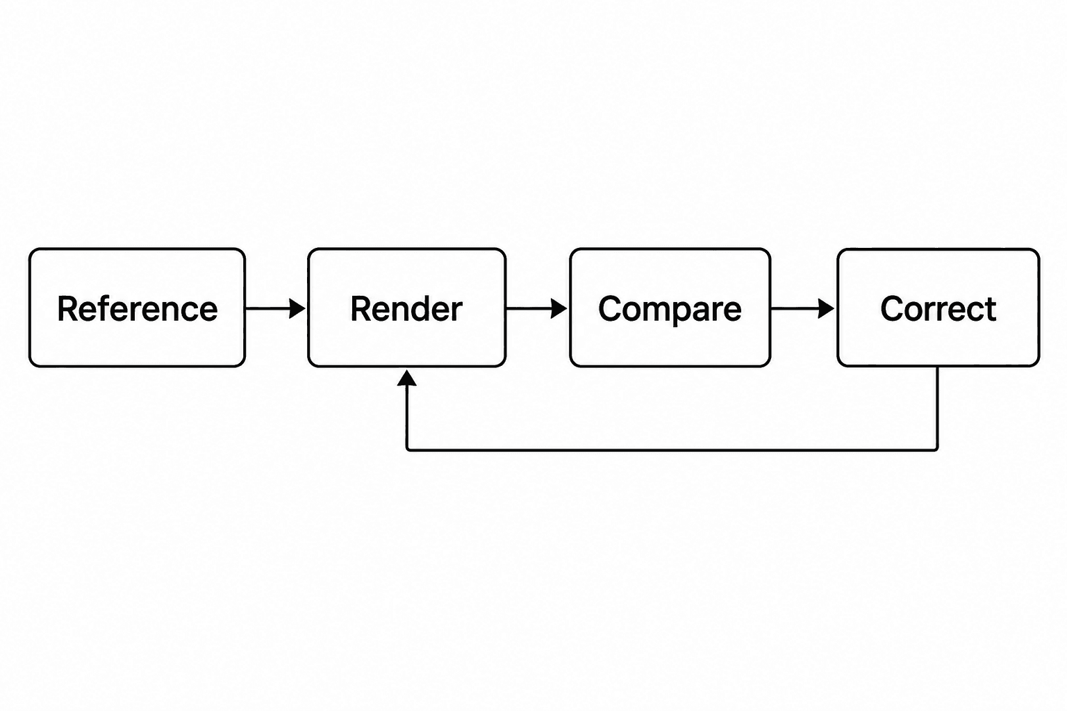
Correct a bounded area
Give each correction a location, an observed problem and an intended result:
In the mobile pricing section, the plan descriptions push the prices out of view. Shorten the repeated description layout while preserving the copy. Keep each price beside its plan name. Render the section again at the same width.
Preserve what already works. A spacing repair should not replace the typeface or rewrite the offer. If a correction changes the broader design, inspect those consequences before accepting it.
Also check the states a screenshot may miss: keyboard focus, an empty form, an error message and an open menu. Visual clarity must hold when the visitor starts using the page.
Keep the useful instructions
Download the UI review skill. It packages the review sequence into Markdown for a project-local Claude Code skill. Save it as .claude/skills/ui-review/SKILL.md, then invoke /ui-review with the page and reference. This location follows Claude Code's documented project skill format. Skill documentation.
The download is an instruction set, not a measured claim about model performance. It requires a running page and browser or screenshot access. Check its behavior on your project before making it part of a larger workflow.
SiteSorted's design standard is fidelity to the intended visual direction: considered type, spacing, imagery and behavior across screen sizes. A useful review makes that standard concrete. Name the target, inspect the output and correct the difference that matters.
Launch CEO read
A launch page should make the buyer, promise, proof, and next action obvious. SiteSorted uses this same standard when it turns a brief or reference site into a builder-ready page.
Start your launch build